
The practical answer
- Short answer
- The board deck arrives 20 days too late. Here are the 12 leading metrics PE operating partners should watch weekly across SaaS and tech-services portcos.
- Best fit
- Industry: B2B Tech / Services. Function: Operations
- Operating path
- Financial Infrastructure → Commercial Performance → Valuations
- Key metric
- 9.8% Median Professional Services EBITDA in 2025 (Lowest in 5 years)
You manage eight companies. You have roughly five hours a week for each one.
That is the real constraint nobody puts on the operating partner job description. You are not running one company well; you are catching the one company that is quietly breaking before it shows up in a board deck 20 days from now. By the time that PDF lands, the quarter is two-thirds gone, the forecast has already slipped, and the cash variance you are reading about is a fact you can no longer change. The board deck is an autopsy. You need a smoke detector.
Here is the failure mode I have watched repeat across portfolios: a company reports green, green, green, then misses the quarter by 30 percent in the final three weeks. Everyone acts surprised. They should not be. The adjusted EBITDA bridge looked clean right up until someone scrutinized the one-time add-backs. The pipeline looked healthy right up until you noticed it was stuffed with deals that had not moved in 90 days. The signal was always there. It just was not on anyone's screen until the lagging number forced the conversation.
The fix is not more reporting. It is fewer, faster numbers that lead instead of lag. Below are the 12 I would put on a weekly dashboard across a tech middle-market portfolio, split between the SaaS companies and the tech-services companies, because those two business models break in completely different places. The benchmarks are drawn from the KeyBanc 2025 SaaS Survey, Benchmarkit's 2025 performance data, and SPI Research's 2025 Professional Services Maturity Benchmark. These are the lines I would draw to decide which company gets my five hours this week.
I have watched a portfolio company report green for three straight months and then miss the quarter by 30 percent. The number that would have warned us was always there. Nobody was looking at it weekly, because the board deck only comes monthly and arrives after the damage is done.
The 12 numbers, and the line that triggers a phone call
Group them into three panes so a glance tells you whether the problem is growth, margin, or cash. The point of a threshold is not precision. It is to remove the argument about whether something is a problem.
Growth: is the engine actually efficient, or just loud?
- 1. CAC Payback. Months to earn back the cost of landing a customer. In the cheap-money years, 24 months passed. KeyBanc's 2025 data puts the median at 20-25 months, with the top quartile recovering cash in under 12. My line: above 18 months and growth is destroying value, not building it. Fund less of it.
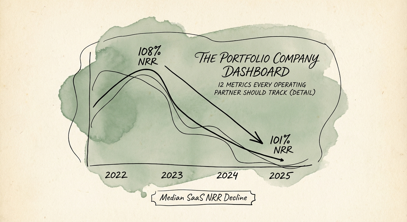
- 2. Net Revenue Retention. Benchmarkit's 2025 figures show median NRR drifting to 101-104%, down from the 108%-plus of 2022. Below 110% and the new logos your sales team is celebrating are mostly refilling a leaking bucket. NRR is the single number I would protect first in any turnaround, because it compounds in both directions.
- 3. Weighted Pipeline Coverage. Forget the old 3x rule of thumb. With competitive win rates compressed to roughly 17-20%, early-stage pipeline needs closer to 4x coverage to land the number. Watch the weighting, not the raw total: a CRO can hit 4x on paper with deals that have not advanced a stage in a quarter.
- 4. Forecast Accuracy. Variance between the Day 1 commit and the Day 90 actual. Tolerance is plus or minus 10%. Miss it two quarters running and stop blaming the market. That is a sales-leadership problem, and it is the cheapest one on this list to diagnose.
Margin: where the EBITDA actually leaks
- 5. Billable Utilization (services) or ARR per FTE (SaaS). This is the metric that separates the two business models. For a services portco, SPI Research's 2025 benchmark shows median billable utilization has slid to 68.9%, well under the 75% you need for healthy margin. Every point under 75 is salary you are paying for nobody. For SaaS, the equivalent is revenue per head; with AI tooling, ARR per FTE should clear $200k.
- 6. Unadjusted Gross Margin. Include cloud and customer success in COGS. SaaS belongs at 80%-plus; tech-enabled services at 40-50%. A SaaS company sitting at 65% is a services business wearing a software costume, and the exit multiple will treat it that way.
- 7. eNPS. The earliest possible warning on delivery failure. Below 20 means key-person risk is already in the building. In a services turnaround I track this monthly, because your people quit before your clients do, and the client churn shows up 90 days behind the resignations.
- 8. Support Ticket Backlog Growth. Week-over-week change in open tickets. More than 10% WoW growth is a quality or staffing problem that becomes churn a quarter later. This is the cheapest leading indicator on the board and almost nobody puts it in front of the operating partner.
Cash: the number that does not negotiate
- 9. Burn Multiple. Net burn divided by net new ARR. KeyBanc's 2025 survey has medians stuck at 1.8x-2.0x. Efficient today means under 1.0x. Spending $2 to manufacture $1 of ARR is value destruction with a growth label on it.
- 10. Cash Runway at Zero Revenue. Cash divided by gross burn, assuming inflows go to zero. Floor: 12 months. In a turnaround, do not let the CFO calculate this on net burn. Assume collections freeze and stress it from there.
- 11. Rule of 40. Growth plus profit margin. Only an estimated 11-30% of private companies clear it right now. Under 20 is the danger zone: not growing fast enough to justify the burn, not profitable enough to stand alone.
- 12. Unadjusted EBITDA. No add-backs. SPI Research puts median services EBITDA at 9.8%, the lowest in five years. When adjusted EBITDA reads 20% but the bank balance is shrinking, the adjustments are the story. Look at the raw number.
Make the dashboard a ritual, not a report
Twelve metrics across eight companies is 96 data points a week. You will not study them. So do not try. Run the dashboard exception-based and let the colors do the triage for you:
- Green: within plus or minus 5% of plan. Say nothing.
- Yellow: plus or minus 10%. One sentence from the CEO, in writing.
- Red: beyond 10%. The phone rings within 24 hours.
That structure does something a board deck never will: it makes the portfolio CEO own the number before you ask about it. They know red means the call is coming, so they get ahead of it. The dynamic shifts from reporting news to managing variances, which is the entire job.
Two operating rules make it work. First, it lives on one screen. If you scroll, you have lost the narrative, and the point is to see the correlations a multi-tab spreadsheet hides: ticket backlog (8) spiking, then eNPS (7) sagging, then NRR (2) softening a quarter later. That chain is visible in seconds on one screen and invisible across twelve tabs. Second, you do this weekly, not monthly. The whole value is catching the slide while you can still act on it.
This is the difference between financial engineering and operational engineering. Leverage alone stopped manufacturing returns a long time ago; today's multiples are paid for predictable revenue, efficient delivery, and systems that scale without the founder. A dashboard does not create those outcomes. It just tells you, this week, which of your companies still needs you to.
If you want the cadence in more detail, here is the weekly flash report we built during a live turnaround. And if the numbers feeding your dashboard cannot be trusted in the first place, fix that before anything else by auditing the underlying board reporting metrics.